Pocho
Team
Creative Direction: Vic Rojo
Brand Design: Vic Rojo
↓
In the realm of crafting the visual identity for Pocho, a brand specializing in kids' pajamas and cozy attire, our focus was to encapsulate the very spirit that makes childhood magical.
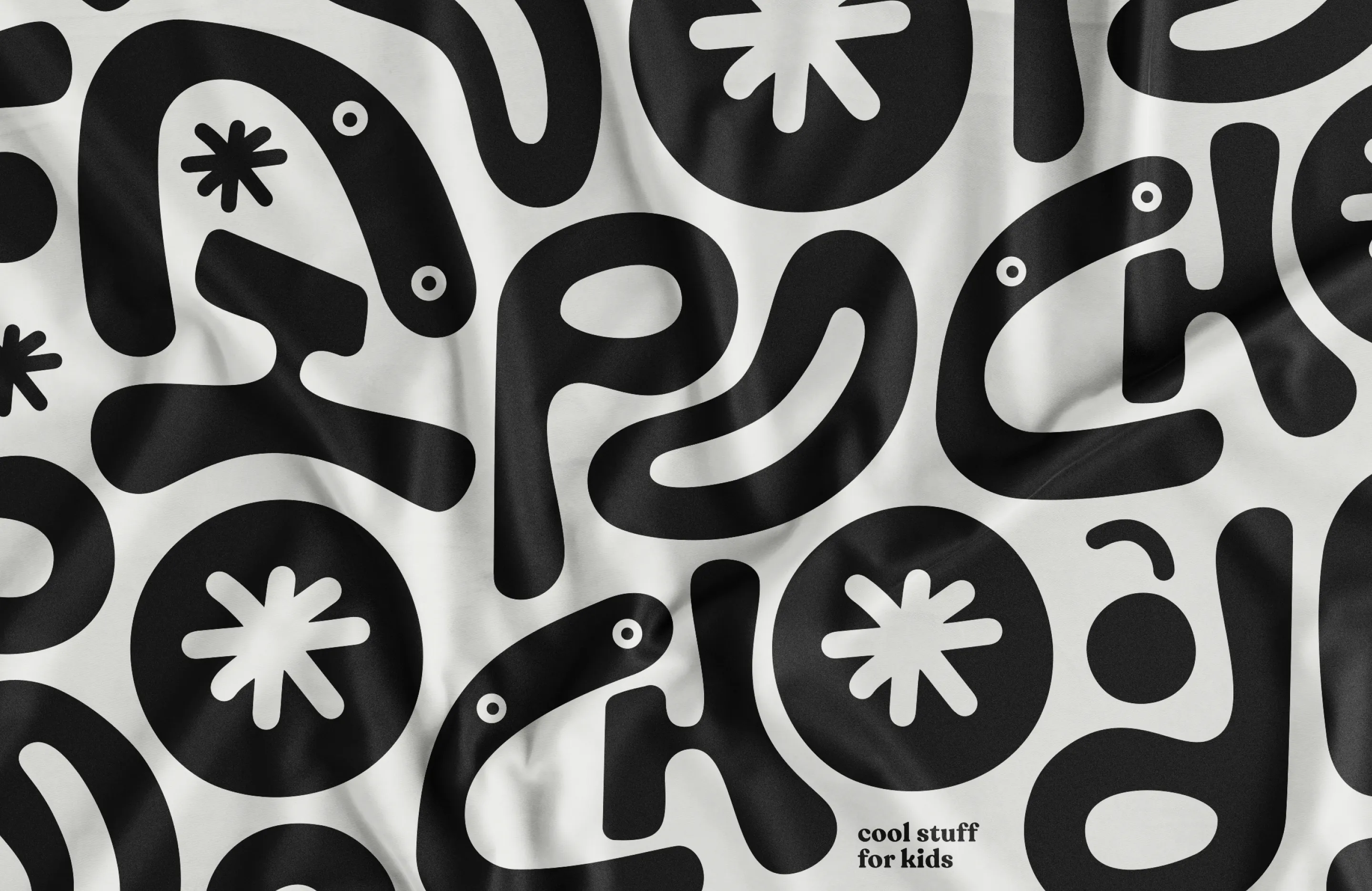
To convey this idea we create a fluid logotype that's not just a set of letters but a playful dance of possibilities. The arrangement of letters isn't static; it's a dynamic expression, much like the ever-shifting landscape of a child's imagination during play. It's intentional chaos that echoes the joyous unpredictability of exploration.
But there's more to the story. Embedded within the font is a secret companion, a mischievous character yearning to escape the confines of the paper. It's a design choice that goes beyond aesthetics; it's a celebration of the lively curiosity inherent in every child.
This character doesn't settle in one place. It travels through the brand layouts. It's the embodiment of a child's gleeful exploration, a friend navigating the vast world of Pocho.
In shaping Pocho's style, we've got a trick up our sleeves. Cream and charcoal are our main colors, giving a timeless vibe. Why? Well, because with each new season, we splash in extra colors inspired by that season's mood. It's a perfect solution – our steady base enhances the colors of the clothing patterns, and the added seasonal hues keep things fresh and exciting.